Delinuts
Identity
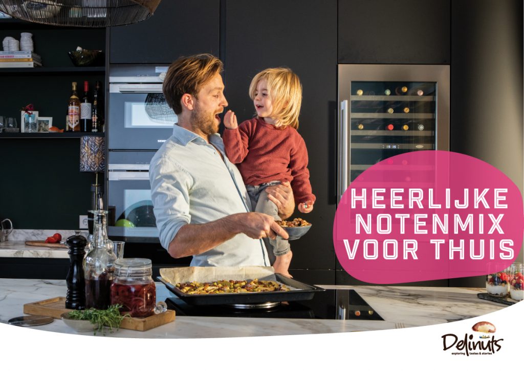
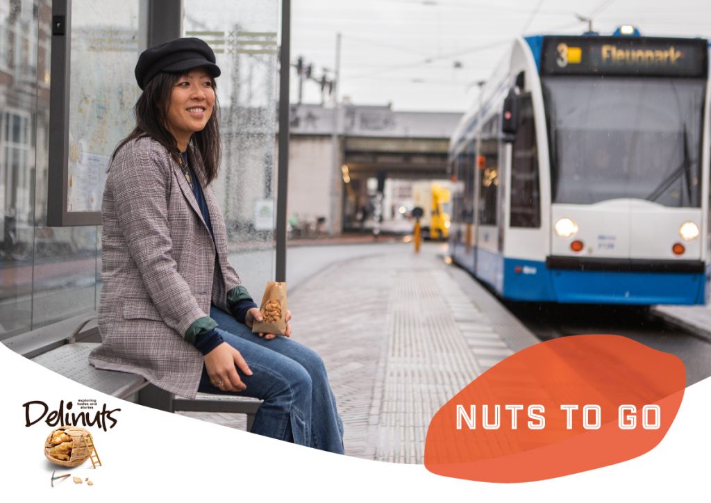
Delinuts wants to be the most modern nut wholesaler of Europe. RCLM was asked to create the identity. Starting with a restyle of the logo, we’ve developed a striking corporate identity. No images of a pile of nuts, but nuts presented as the hero. Spherical pictures of happy consumers. Nuts all throughout the day, whether it is time for breakfast, dinner or a snack. Let us tickle your taste buds.


Modernising a logo without changing the feeling of the brand.
A difficult restriction creating a new style, but we could not be more happy with the result. The logo written in a powerful font with lots of personality, the dot on the i presenting a nut, without being too obvious. The shape of different nuts are used as graphical elements, all throughout the corporate identity in notable colours, which give Delinuts a nice bite.